
Frédéric Bouché, a postdoctoral research with Richard Amasino at the University of Wisconsin, recently caught our attention when he published a set of impressive visual abstracts to support his latest research papers. We invited him to share how and why he makes these images. -Editors
When you work hard, and your scientific work is finally out, you want to reach out the science community. However, scientists are busy; to catch their attention, you need to communicate efficiently. Summarizing your research in a graphical abstract/infographic is a fantastic way to grab the attention of many readers. I love reading graphical abstracts, and even if the work is outside my field of expertise, it helps grasp the take home messages. Hence, I decided to advertise my scientific outputs in a similar way, so that people can learn about what we are doing within a few seconds. Then, it is up to them to check out our article if they want to get more information about the methodology and results. Posted below are a few infographics I created that summarize my recent papers.
To draw the infographics, I use a vector-based program called Adobe Illustrator. For those who do not have access to this app through their institution, there are free alternatives, such as Inkscape. Many scientists are familiar with these programs, as they use them to create final versions of their article figures. Instead of using a grid of pixels, the vector-based programs schemes are drawn using paths (line, square, custom shape, etc.) associated with attributes (e.g. color, width, etc). Schemes are thus encoded in a mathematical format, though you only see the graphical output of it. The great side of it is that vector-based images can be scaled up without losing resolution. The PDF format is one example of vector-based graphics: you can zoom as much as you want on the text of a PDF, you will not see any pixels. It is because the letters are made of vectors, not pixels. Using such format for your infographics has several advantages, as they are scalable, create smaller file sizes, and allow you to export your image in various file formats.
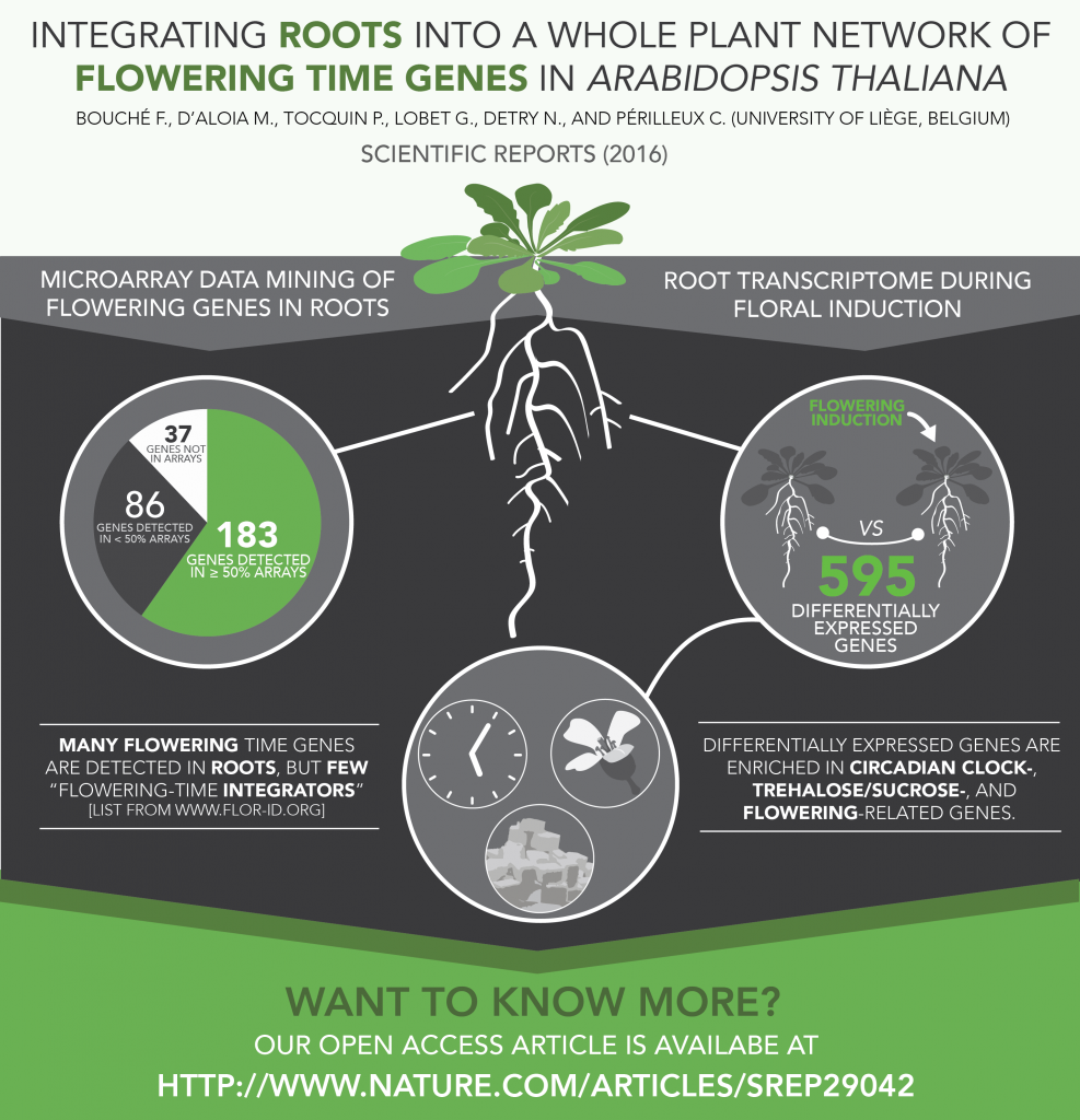
Though these programs are complicated and not very intuitive, anyone can get great results after some practice. I do not have any academic training in graphic design/drawing. To get started, I did a two-day Illustrator training provided by my university. Such training is freely available in many universities and will give you the basic knowledge about vector graphic design. Afterward, just have fun and practice. Having a concrete goal in mind helps. In my case, I wanted to draw complex Arabidopsis gene networks. At first, my drawings were ugly, but I kept working and ended up with more satisfying results. By taking advantage of the vector-based graphics format, we could add interactivity to these schemes. With Guillaume Lobet, we ended up creating a database of the networks controlling flowering in Arabidopsis thaliana, called FLOR-ID (http://www.flor-id.org).
You might argue that it could be easier to incorporate clipart elements instead of drawing them. I never do it, for two reasons; the first one is that I do not want to worry about copyrights (though you can refine your Google Image research parameters to find free to reuse and/or modify pictures). The second one is that available clip arts most often do not suit my needs, and they do not offer any flexibility. So, let’s draw what we need!
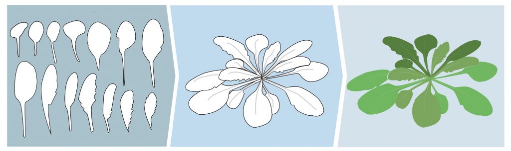
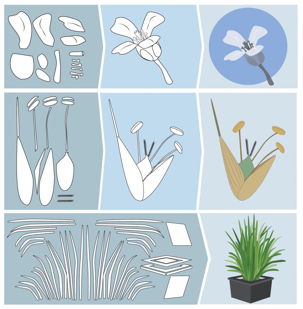
One thing to keep in mind is that almost every complex-looking object is made up of simple parts. For instance, the Arabidopsis shoot is made up of leaves that have simple shapes. Use your favorite Arabidopsis picture, import it in your vector-based program, and use it to draw the form of one leaf; then, duplicate it, change its size, orientation, color, and assemble the leaves to create a “complete” rosette. Using such a method will help you to create nice-looking schemes. You just have to do it once per species, then adapt the look of your plant according to your needs: add an inflorescence? A bigger root system? No problem!
Now, what are the key steps to draw an infographic:
- Before starting, look at infographics on the web to get some inspiration and have an idea of the output you want.
- To not try to fit all the results of your article in the infographic. First, identify the take-home message(s). Keep it as simple as it can be without compromising scientific data. What are the key methodological elements used in the study to reach this result? Try to stay as concise as possible and put yourself in the mind of a reader unfamiliar with your research topic.
- Limit your infographic to four/five colors (the free Adobe Kuler online tool helps you to find matching colors), including one or two eye-catching colors that you will use to highlight key data.
- Limit the amount of text. Ideally, use only complete sentences for the take home message.
- Carefully choose your font. Try to favor “sans ms” fonts (e.g. Myriad Pro, Avenir, Futura, etc.), especially for titles. Do not use more than two fonts and use different weights of fonts in the same family (e.g. key information in bold).
- Do not overcharge the infographic. You can leave “empty space” around data to draw attention to them; photographers are familiar with this concept, known as “negative space.”
- Try, try, try. Vector-based programs allow you to have several workspaces opened at the same time. I duplicate my workspace all the time and try new things. You can also use the “save version” function, which allows you to keep intermediate versions of the work. The modifications you just did are ugly? Just go back to the previous version!
- When you are done, show the infographics to your colleagues and also with people less familiar with your topic. They represent the public you target, so take their comments into account.
- Now, let’s communicate! Twitter, Facebook, or any social media are great places to share your infographics. You can also print it, use it as a graphical abstract for the online version of your manuscript, etc.
There’s no doubt that people are drawn to graphic images, and that learning how to communicate your science visually is becoming a necessary skill for scientists. Thanks to Frédéric for sharing his secrets and for the great examples of what we can do with the tools we have available.
Connect with Frédéric on Twitter to learn more!
Muy importantes vuestros aportes en el conocimiento del mundo vegetal.
I really enjoyed reading your guide. I would like to add one point though, because I feel it is necessary:
Follow a grid to align your elements. It can be broken up if need be, but in general properly aligned images are more eye pleasing.
I’ve seen many presentations in my day that were full of misaligned boxes all over the place. That’s why I felt the need to mention this here.
Cheers!
Hi Joram,
Thanks for your comment!
I totally agree with you, using grids to align elements is essential in 99.99% of the situations. Should have mentioned it!
Cheers